
A single coat of paint on a front door can transform a house’s curb appeal without requiring any other work. This upgrade demands no structural changes, only a few hours and a can of paint. However, the right color choice depends less on current trends than on how it complements existing materials—stone, brick, siding, or trim—around the entryway.
Pairings that avoid clashing with what already exists tend to work best. For instance, a deep teal door against mixed stone creates a high-end aesthetic by enhancing cooler grays in the masonry. The green undertones make the stone appear purposeful rather than random. This effect is most successful on homes with natural stone or brick, where the contrast feels deliberate.
A soft blue door on a bright white house is another near-guaranteed option. It remains neutral enough to avoid overwhelming the exterior while adding enough color to prevent the front from appearing flat. The painted panel details on the door itself contribute to depth without needing extra trim or hardware. This combination works particularly well on modern or minimalist homes, where simplicity is a priority.
For those who prefer a dark door without the starkness of black or navy, plum offers warmth and richness. It pairs well with cream exteriors and brass hardware, avoiding the coldness of flat black. The color’s depth makes the door feel substantial, while its warmth keeps the entry inviting. Unlike black, which can absorb too much light, plum retains a subtle glow, especially in matte finishes.
Unexpected colors for brick and stone
Dusty mauve is the pink shade that avoids looking juvenile. A matte finish and brass fittings ground the color, preventing it from appearing overly sweet. The key is avoiding glossy versions, which can intensify the pink’s brightness. This shade works best on homes with neutral or warm tones, where it adds softness without competing with existing colors.
On red brick homes, pale purple is an unexpected yet effective choice. The cool undertones complement the brick’s warmth without conflicting with it. Leaded glass panels in the door help anchor the look, making it feel intentional rather than experimental. This pairing is particularly strong on older homes where traditional details already dominate.
Related Post: Portuguese Home Packs Multifunctional Details Into Tiny Space
Sage green stands out as the most universally flattering door color. It works on light stone, dark brick, white siding, or gray render without clashing. Brass hardware enhances it from a basic paint sample to a polished entry. Unlike brighter greens, sage does not shift unpleasantly under different lighting, ensuring the final color matches the swatch.
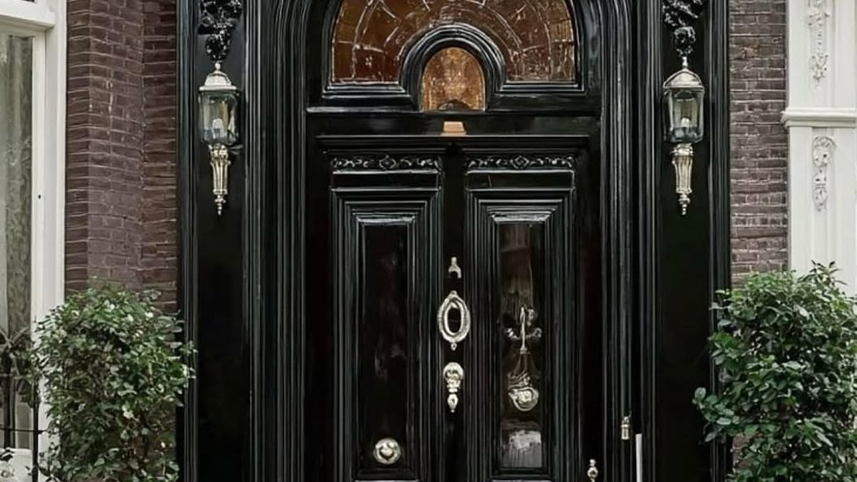
Matte black double doors may seem dramatic, but the finish softens their impact. Flat black absorbs light instead of reflecting it, preventing the entry from feeling cold. Arched glass panels with interior lighting help balance the darkness, making the door appear open rather than imposing. This effect is especially noticeable in larger door frames, where solid black could otherwise dominate.
Bold choices for statement entries
A navy door with gold inlay offers a custom appearance without the expense of high-end materials. The metallic detail adds sophistication, while navy provides a bold base that does not overpower. This combination works best on homes where the entry already features architectural interest, such as detailed trim or a grand porch, to support the statement without looking out of place.
On older homes with stone trim, burgundy delivers a traditional yet refined appearance. The deep red undertones enhance the warmth of cool stone, preventing the exterior from looking severe. Similar shades like wine or ox blood achieve the same effect: quiet richness without heaviness. This color is particularly effective on historic properties where classic details matter.
For starter homes, navy on a modest porch is the safest upgrade. The color is dark enough to look substantial next to light siding but familiar enough to avoid risk. Adding brass hardware and a simple welcome mat completes the look, making the entry feel intentional without requiring landscaping changes.
Mustard yellow against gray siding instantly brightens a dull exterior. The brown undertones keep it warm rather than loud, avoiding the cartoonish effect of brighter yellows. Pairing it with greenery on the door, such as a basket of ferns, adds life to the entry without overwhelming the color.


